

CureMN
Design strategy for a rural Minnesota based non profit. Cure is empowering rural communities to connect and take action on issues such as environmental awareness, education, and activism.
My Role
UX Researcher, UI Designer
Methods
Stakeholder Interview, Deep Dive/Secondary Research, Touchpoint Map, Annotated Wireframes, Client Presentation
Tools Used
Figma/Figjam, Miro, Notion, Adobe Premiere Pro
Problem Space
Project Focus
In the stakeholder interview, we learned that Cure is seeking to enhance their website’s dashboard and social media to effectively communicate their mission and draw in new members, more specifically expanding their user base to draw younger constitutes to their cause.
While their current member base is loyal, the organization has difficulties finding interested individuals outside of that base. They are hoping, with our help, to branch out and connect with those who might not have heard about them otherwise.
Solution
-
Enhance CURE's communication strategy to effectively convey their mission and activities.
-
Target and engage a younger demographic to broaden CURE's audience reach.
-
Formulate a strategic plan focusing on key touchpoints, including the website, email campaigns, social media platforms, and advertising efforts.
-
Elevate social media engagement to strengthen CURE's online presence and community interaction.
-
Mitigate the issue of bounced emails to ensure consistent and reliable email communication.
-
Increase the number of subscribers to CURE's email list, thereby expanding their outreach and support base.
User Groups
Current Users
Users who are already accessing Cure’s website and social media are Rural Minnesotans who care about the future of their communities.
The Youth are the Future
Cure is looking to get younger people involved, with their primary focus being getting Generation Z and Millennials engaged in community action, volunteering, and activism.
Deep Dive Research
Competitive Analysis
We analyzed other nonprofits who are doing similar work to Cure to discover what they were doing well and how we could learn from them.
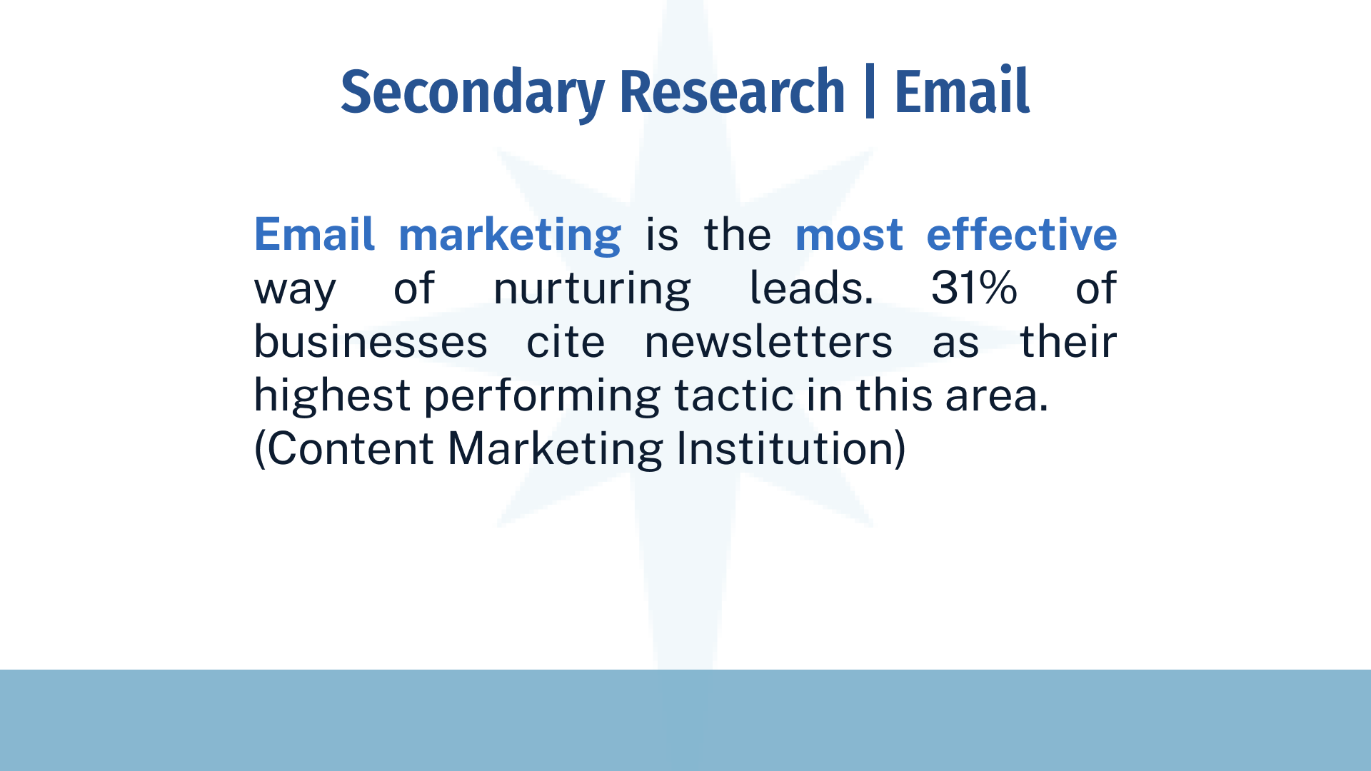
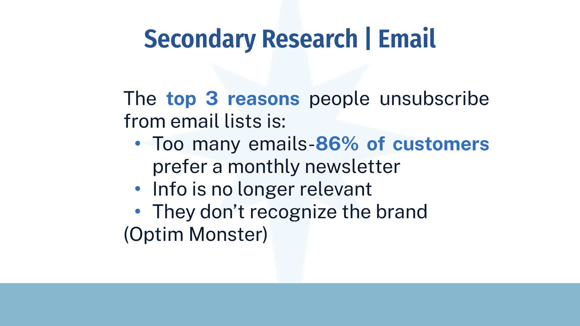
Secondary Research
We reviewed research from credible sources as well as Cure’s analytic history to understand what ways that their existing design strategy could be improved upon.
Touchpoint Map
After competitive analysis and secondary research, we developed a Touchpoint Map, which allowed us to visualize how all of our improvements would fit together to create a cohesive experience for the user.
Research Findings


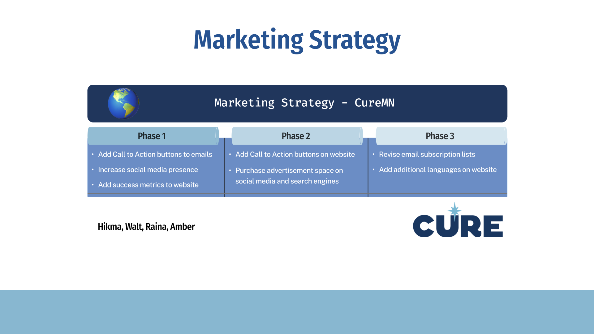
Solution
In order to get younger people involved with Cure’s mission, we had to increase the visibility and adaptability of their online presence. This meant finding ways to improve upon their current website and newsletter design, as well as recommending a strategy to increase the effectiveness of their advertising and social media approach.
With an understanding of the organization’s mission and their users and the competitive landscape, our design team crafted a plan to prototype the recommended changes. My area of focus was the organization's website.
Sketches
Website Recommendations


Designing for Impact
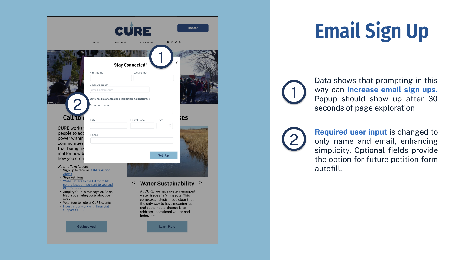
High-fidelity annotated wireframes were designed to ensure that CURE's website would be both visually appealing and user-friendly.
The changes were informed by extensive research findings, such as the need to simplify their messaging and feature their call to action and supported causes on the first page.
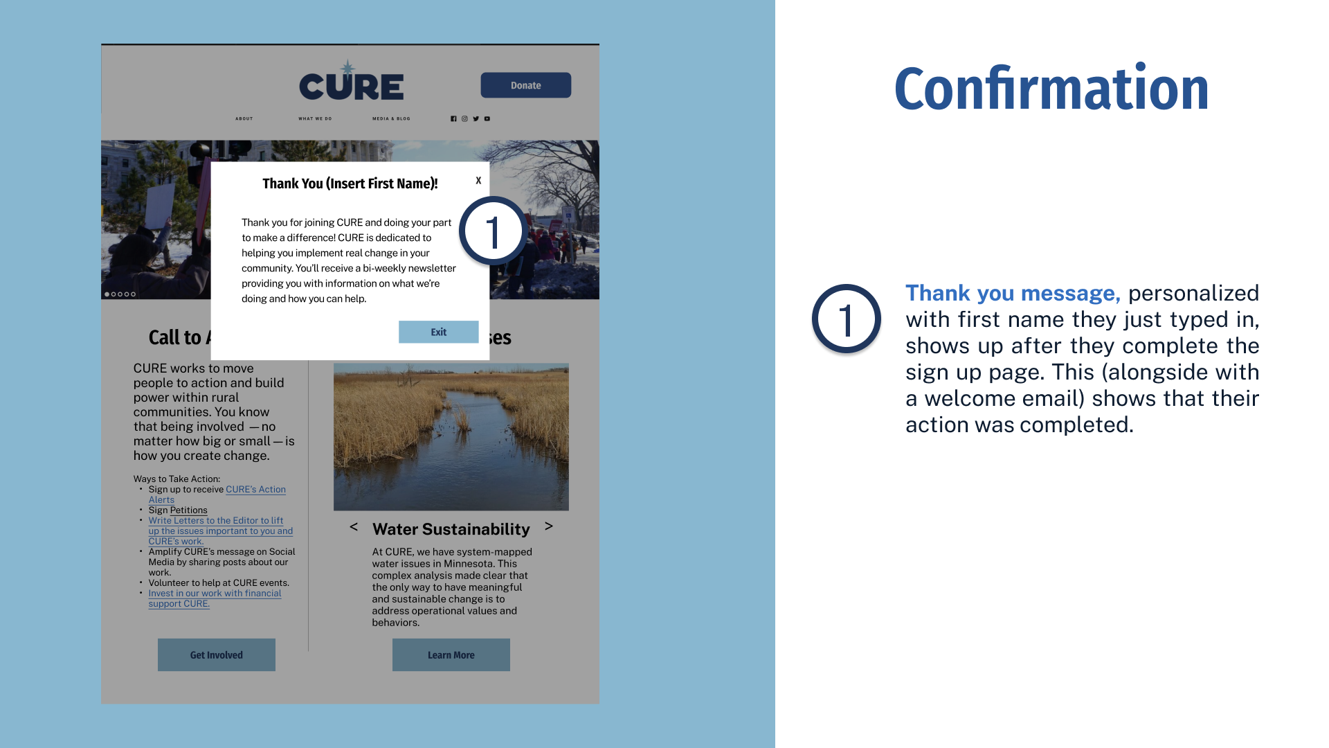
A static email sign-up form was replaced by a pop-up that appears after a user spent some time on the site, taking into account research indicating significantly higher sign-up rates with this approach. CURE identified email sign-up rates as critical for future growth and community engagement.
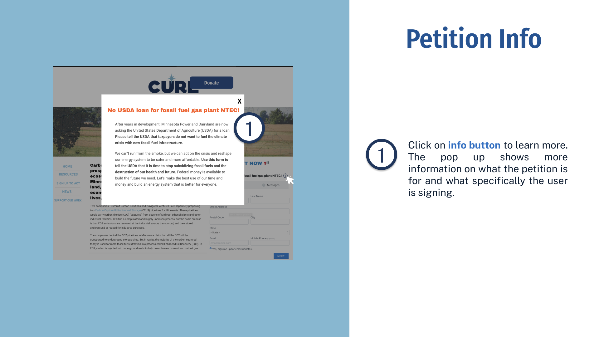
The placement and visibility of the donate button, petition banners, and personalized thank-you messages were also optimized for a more impactful user experience.
Reflections
Key Takeaways
Working with a nonprofit posed unique challenges that we had to navigate. Nonprofits often operate under tight resource constraints, including budget limitations and a small team. As a result, our recommendations needed to focus on impactful solutions while being mindful of cost-effectiveness and resource limitations.
If we were to extend this project, we would opt for a more hands-on approach. This would involve full interactive prototyping and extensive user testing to gather valuable insights. We would then use these findings to inform the implementation of necessary changes, prioritizing the needs and preferences of our primary user base.